Concept
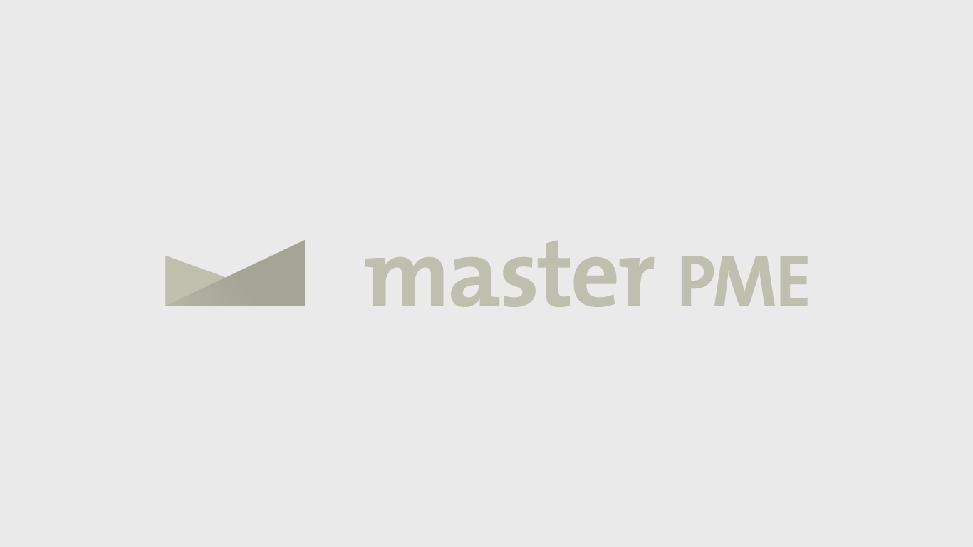
Master PME is a France based consulting company focusing on business financing and digital marketing. They were looking for a modern and sophisticated design including a distinct logo mark that works with or without the typography. Inspired by the negative space below the first letter of the company name (capital M) I developed the crown shape. It is geometrically constructed by overlapping two right triangles facing the opposite direction. They share the same base width and the one facing right is a bit higher. This crown stands for quality service and the slanted edge promises growth which is every business’s goal. For more depth I used a different shade on each triangle. Additionally I applied a subtle gradient to the front one to underline the idea of growth and to ease off the bold geometry of the triangle when viewing the composition as a whole.


