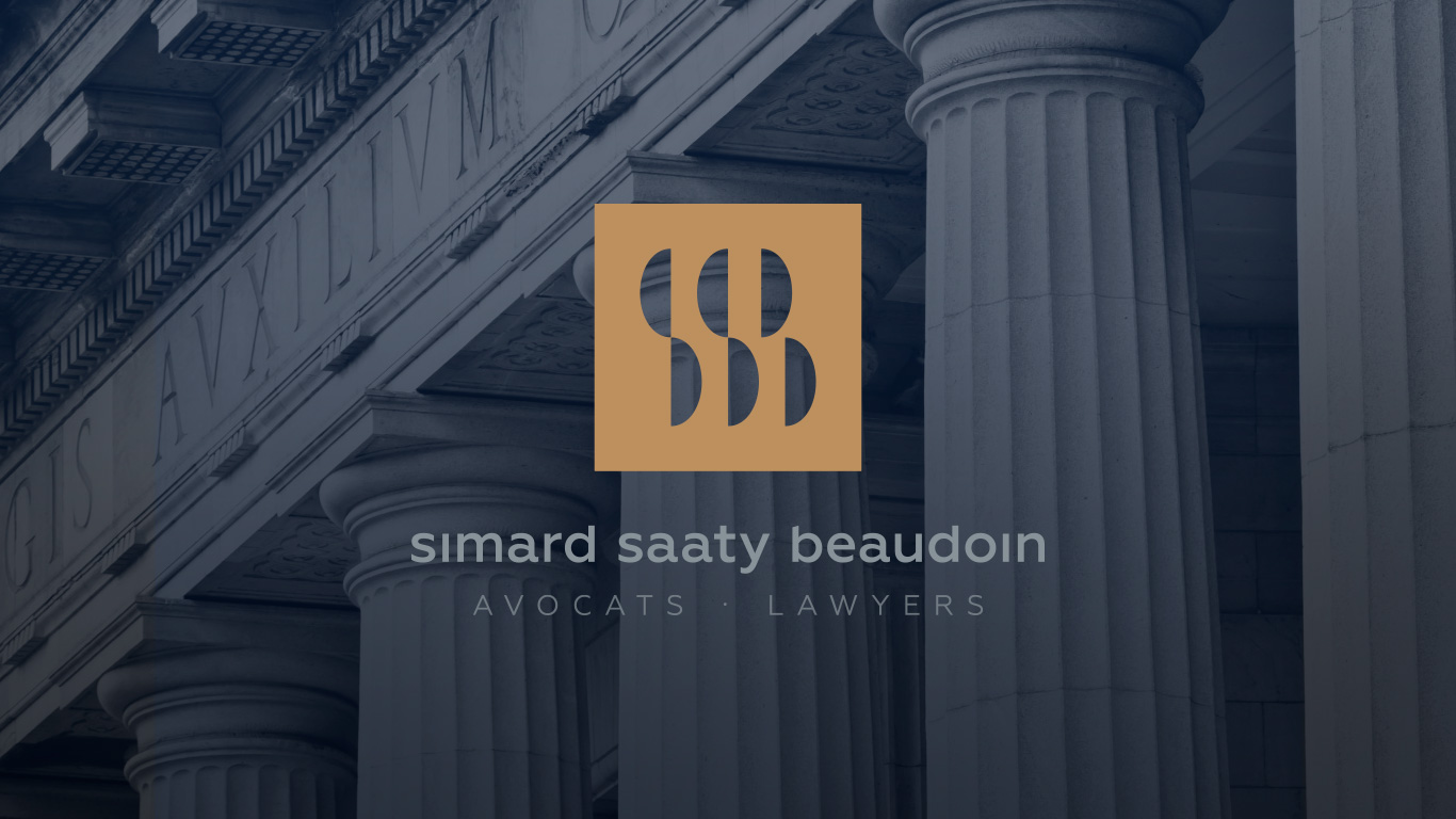
Logo design for French Canadian law firm
Simard Saaty Beaudoin

Concept
The logo for the Quebec-based law firm consists of the initials of the three law partners. The negative space of the letters SSB is represented by scale pans – a common symbol for the balance and equality aimed to achieve in the judicial system. In the further design process I boxed the mark in a colored rectangle to increase density and visual comprehension.
I complemented the features of the logo with a clean geometric sans serif font. Naming the three partners in the same line suggests their hierarchical equality. The lowercase, lowered ascenders and omitting the tittles (dot over an i) contrasts the strict geometry and makes the brand more approachable.


